3/4
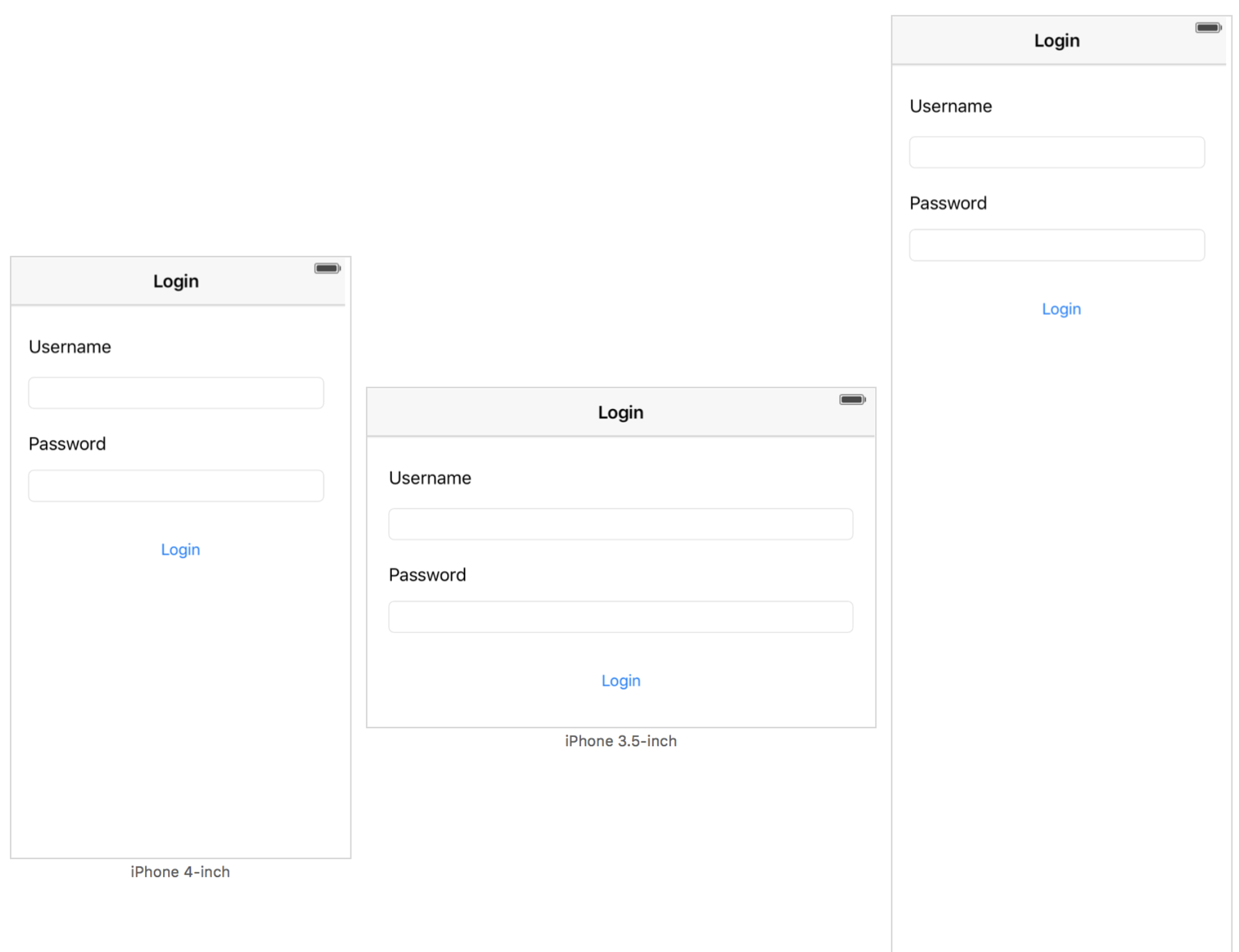
1. Login View for different devices
Create a new app with the following screen layout in a ViewController using StoryBoards:
Tip
The NavigationBar should have a constraint defining its width to be the same as the superviews width. Add the same constraint for the Textfields but have the width reduced by 20 pixels on each side by constraining it to the margins of the superview. All views (Labels, Textfields and Button) should be positioned relative to each other on the y-axis by defining the distance constraint to each other. Have the Labels and Textfields aligned to each other using the alignment function. Use the fix issues button to add missing constraints or fix the positions of the views.
| Checklist | |
|---|---|
| Use the preview function of Xcode to check the views on different devices and orientations. The result should look like the one above. |